What Makes a Good Signage Design? Effective Design Tips for Success
Have you ever wondered why your business is not attracting enough customers despite your location's convenience? Check out your signage design. Oftentimes, a signage that is poorly designed can be one of the main reasons why potential customers don’t stop by your business.
Signages that are too small, lack clarity or are outdated can easily go unnoticed and be replaced with more attractive ones. This is why working with a reliable sign company is important to ensure that your business’ signage design is up to date, visually appealing, and reflects your brand identity.
But while they can help you create an effective sign design, it’s also important that you understand some basic principles that can make or break your business' brand identity. Continue reading this blog to know more.
What Is a Signage Design and Why Is It Important?
A signage design involves visual graphics that display information in the form of words, numbers, logos, images, or a combination of these elements to relay or communicate the main message to prospects, typically for advertising purposes.
Depending on the type of business and the marketing objectives, a signage design can be used in different settings where people can easily see the message. This often involves high traffic areas and corner placements such as entryways, busy hallways, and places where people tend to hang around.
From bus stops to public medians, custom signs are everywhere to help inform people about a product, service, event, or direction. In simple terms, signage design is an important form of communication that not only helps businesses stand out from the competition but also allows people to easily access the information they need at a distance.
How Do You Create a Signage Design?
Creating a signage design involves several steps that require both creativity and strategic thinking. This involves planning out the space where the sign will be placed, deciding what kind of materials should be used for durability and visibility, designing a layout that matches the company’s branding and message, and considering how to best reach out to the target audience.
If you are a new business starting to build your identity or you are just looking to refresh your brand, custom logo design may also be included in the signage design process to ensure that your new sign aligns with the brand identity of your business.
What Are the Characteristics of A Good Signage?
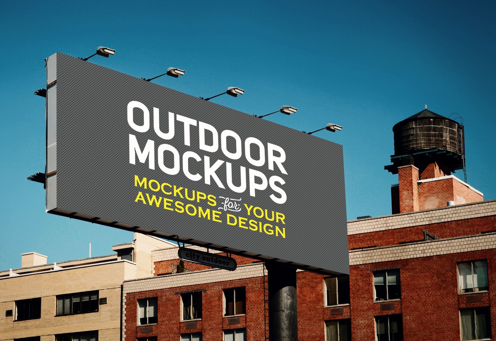
Image by CosmoStudio on Freepik
A good signage design is one that is simple yet powerful, eye-catching, and communicative. But most importantly, it should possess the following characteristics to be effective.
Visible
A good sign should be visible not only to people near it but more importantly, it should have a good visibility from a distance. This means taking into account factors such as the sign’s size, colour and placement.
Informative
An effective sign should serve its purpose and be able to provide relevant information to its audience. This includes events, announcements, special sales, promotions, and more, which people could benefit from.
Close Proximity
The proximity of a sign design is important in determining its effectiveness. If a sign is placed too far away, it runs the risk of the potential customer forgetting about it. To prevent this, signs must be placed multiple times along the way to reinforce the message and ensure better retention.
Good Graphics
Sometimes, people remember a sign not because of the statement but because of the overall design. An effective signage is one that captures the attention of the audience and conveys the message to them with just a single glance.
What Makes a Signage Attractive and More Effective?

Image by rawpixel.com on Freepik
To create effective signage that speaks your brand voice, it is important to consider the following factors:
Colours
Colours are one of the first things that people see when they look at a sign design. It is also through a good colour selection that people remember objects, events, and information easily. With the right colours, a signage can create a powerful visual impact that can keep the entire signage design eye-catching and attractive to potential customers.
Different colours invoke different emotions which will not only help create an appropriate atmosphere for your business but can also influence the decision of your customers when buying products or services. Always opt for brighter colours to help draw more attention to the sign.
Contrast
Customers become more attentive to your message when the sign has a white space background. Using the sign contrast method, people can easily grasp your message quickly by creating an eye-catching view from a distance. To do this, 30% to 40% of the sign's face area should be white space for optimal readability.
In case the sign design has a low colour contrast, you can enhance readability by outlining the letters on the foreground. Additionally, you can create a shadow effect or add a thick border around the text to make it more readable.
Font Size
An effective sign should be able to spread information even from a long distance. Generally, people will only read your signage for a few seconds so be sure that they get the message in an instant without even thinking. To make your sign design more visible, use larger fonts. As a general rule of thumb, for every additional 10 feet in distance, the height of the letter should be increased by an inch.
When selecting typefaces, opt for clean and visually appealing options that align with your brand's personality. Avoid using unclear typefaces as they can have a negative impact on your signage and business.
Branding
Simplicity is the key if you want to create effective signage that easily communicates with the crowd. People only have a few seconds to read the entire message of your brand, which means that too many words can cause confusion and miscommunication.
Aside from keeping your design simple yet engaging, use as few words as possible so that people are prompted to pay attention. Make sure your message is clear and concise, without any unnecessary information or details.
Call To Action
An effective signage should be able to create a desired effect and lead your audience to take a certain action. Whether you want them to visit your store, inquire about your products or services, or even just remember your business name and logo, make sure that your sign design stands out and encourage people to take the next step.
Takeaway
In any place you go, a good signage can be very helpful not only in delivering information but also in providing a sense of direction and guidance so people can easily navigate where they are heading.
Ultimately, an effective signage design should take into account the context of the message, its target audience, and the visual impact it creates. It should not only strive to achieve both practical and aesthetic goals but it should guarantee its ability to deliver the desired results successfully.
Using the right combination of colors, contrast, fonts, and branding, you can create a powerful design that can persuade customers to take action. By paying attention to all these elements and design tips, you can ensure that your signage design is successful in communicating its intended message. If you are looking for a good sign company to help you with the design process, contact Unifab Signs today for the best custom signage solutions for your business.
Browse by Categories
- Traditional Signs
- Digital Signs
- LED Signs
- 3D Signs
- Tips and Advice
- News
